I Am Not a Fan of Companies Messing with Users’ Muscle Memories
Table of Contents
Introduction
This is just a rant.
Examples
Not sure when exactly those happened, but here are examples.
YouTube
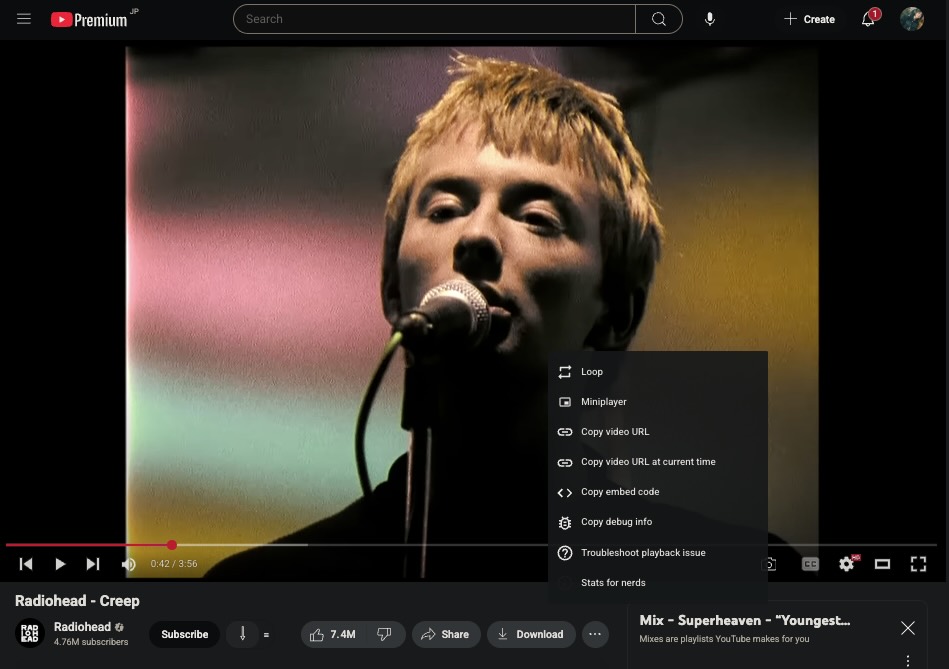
YouTube moved the “Miniplayer” button to above the “Copy video URL” button.
Spotify
| Before | After |
|---|---|
 |
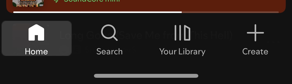 |
’+ Create’ you say… Okay…
My point is…
Oh, man! Why do you need to do this? Every time I try to open my playlists on Spotify, I have to stop moving my fingers and be aware of the fact that there is a new button now. Then I can finally look through my playlists.
Of course, users were not promised about consistency, but let me ask you something: would a car’s ignition switch suddenly move to somewhere else overnight? No, it doesn’t. So, similarly, maintaining stability to ensure a good UX is better than pursuing freshness.
Lastly, it is important to acknowledge that users remember where things are placed. Such inconsistency their experiences. Rant over, good night.